Kate Moss's appeal never ceases to amaze me. She is one of the older models, but she's definitely the winner this season. I loved some ads, but wasn't quite impressed with the rest......  Long Champ -Kate continues to be Long Champ's model this season. She looks really pretty in this campaign. This definitely beats the Long Champ SS06 campaign.
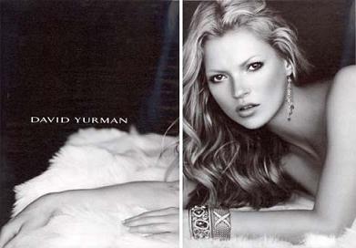 David Yurman -Kate looks gorgeous in these images. But then again, David Yurman ads always have amazing, sharp b&w images. Love this ad!
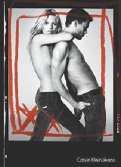 CK Jeans -Kate got famous back in the 90s because of controversial CK ads, and now she's back. She looks very cool of course, but I just think at Kate's age now, she would look cooler and classier if she had a top on, something like a denim jacket.
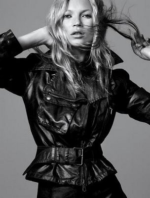 Belstaff -Belstaff is another brand that continues to use Kate this season. She looks so cool in the leather jacket, esp since she's got such a rock chick image.

Stella McCartney -The nature feel of this ad is so different from the other ads. Two words sum up this ad: effortlessly cool.
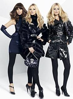 Versace -All the models look super glamorous in the Versace campaign. From the Versace ads I've seen so far, Kate seems to be at the centre of most of the images.
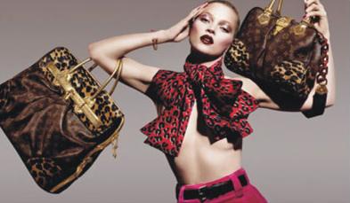 Louis Vuitton -Vuitton's campaign is another one of those mulit-models ad. My feelings for this ad is so and so.
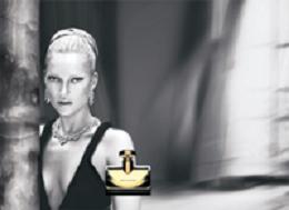 Bvlgari fragrance -There's something about this image that bugs me. Maybe it's her hairstyle or makeup, but I'm just not a fan of this ad.
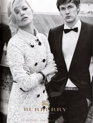 Burberry -The Burberry campaign is my absolute favourite out of Kate's many campaigns this season. I just think she suits Burberry so well -she combines the cool and classic look in one. Out of the Burberry images, I adore this one the most. She looks sooo girly and stylishly cool.
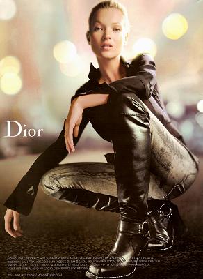 Christian Dior -Dior's campaign is by far, the most unflattering-looking ads of Kate. Seriously, they make her look so old and just weird.
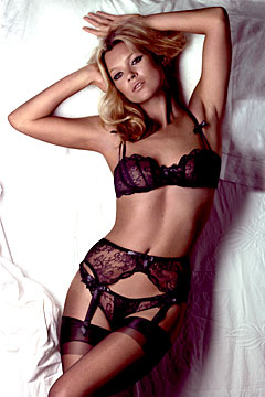 Agent Provocateur -The newest of Kate's campaigns. The founders of Agent Provocateur are Kate's friends, and Kate claims that she only wears lingerie by AP. There's even a video for this campaign on the Agent Provocateur website.
Which of Kate's ads do you love and hate the most?
 When I found out that the original prints of Fifteen were going to be exhibited, I got very excited at the prospect of visiting a quiet art gallery (which is not exactly my scene,) and decided to drag Barneys Girl to see them with me. (BG happily came along since the gallery
  (This cover was not in the exhibition.)

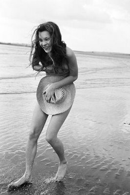 Moss recalled, “I was just having a laugh. Corinne just wanted to bring out everything that I hated when I was 15. My bow legs, the mole on my breast, the way I laughed”.
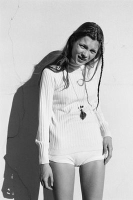 The best part of the exhibition were the contact sheets, (for those who don't know, a contact sheet is basically a print of the original negatives.) These contact sheets showed images Day considered and ones she chose. Day actually discarded the images where Kate put on the typical 'model' look and chose the ones where she looked natural and like a gawky, happy teenager. This was no ordinary fashion shoot. The clothes were not the focus, rather it was Day's aim was to capture the model's personality into film.
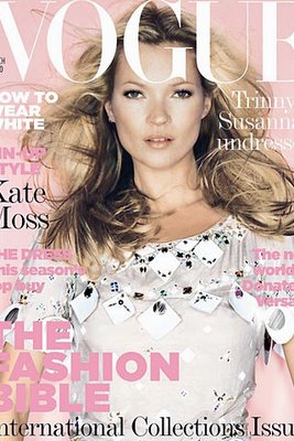 On news stands now is Kate on the cover of the March issue of British Vogue. However, this doesn't necessarily mean there are editorials of her inside, (British Vogue has been known to put her on the cover but not in the editorials.) This British Vogue has four new Kate Moss ads in: Longchamp (only Kate can make Longchamps look somewhat fashionable,) Rimmel (the usual,) Roberto Cavalli and Stella McCartney.
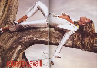 In terms of photography and airbrushing, this ad is excellent. But in general, I just really don't like it. It's definitely not Moss. Maybe I just don't really feel much for the brand.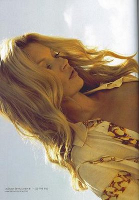
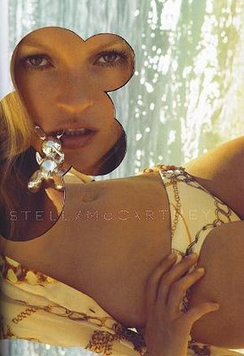 I love this Stella McCartney ad. It's artistic and tasteful. You can really feel the Stella vibe from this photos. And it's so cool how the new photos are basically of Kate looking downwards -put into a horizontal way.

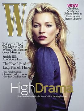
 The new issue of Vogue UK is out! Usually, a new issue wouldn't get me that excited, but this issue has an exclusive preview of the much anticipated Kate Moss Top Shop collection. This issue was such a big deal that even Kate Phelan, co-fashion director of Vogue UK, appeared on BBC Morning to talk about the issue and Kate Moss' line. Actually, the interview was pretty interesting -the interviewer kept trying to bring up negative topics, like is it right for Kate to be earning more money than before after the cocaine incident, or wouldn't the clothes on Kate not look as good as on us? Kate Phelan of course, kept everything positive.
  OK, I'm getting off topic here, my point is, the collection -at least those seen so far -is cool, like seriously cool. And it does look very Kate. From the preview, the collection has mainly composed of vests, blazer, shorts, suit trouser and many mini dresses, all in typical Kate colours -white, black, blue and vintage prints.
  Now this dress I really love. I LOVE the details: one-shouldered with a lapel (gives the white dress an edge), the skirt part looks pleated and it's made of cotton, which seemed like a cheap material choice to me, but it just occured to me that cotton makes it more practical because it could be worn as an uber-cool daytime dress.
 I know everyone has probably seen the scans of Kate's preview online, but trust me, seeing it in print is so much better. Oh, and for those who don't want to spend 3.70pounds for only Kate's interview and preview, there are also a few other pretty editorials and the usual fantastic content to read. Enjoy!
 Of course, being Keds, I am also tempted to try something different and fun, like these Panda (left) and Duck (right) print skimmers from the Eleanor Grosch collection. I quite like the green ones on its own actually, but I'm not sure how it'll look for the overall picture.
 Then of course there are more wild prints from the Nanette Lepore Collection to consider. Note here that I'm only talking about the print, I am not so far gone under the Keds spell that I think the slip on style (right) is cool yet.
 And these. . . well they're simply hideous. ugh.
 First there's Chanel . The ads were quite minimalistic, (but not the most extreme type of minimalism). Some people even felt the ads were boring but I liked them more than Daria's previous ads. The casting director and Karl definitely picked the right model: Freja Beha Erichsen. She is so perfect for this ad -she's got the perfect legs to complement the super short clothes. And even though I'm not a fan of Chanel's bikini bottom-looking shorts, everything looks so perfectly put together and sophisticated. Loves it!
 Then there's Fendi. Another quite but not extremely minimalistic ad (at least the model is standing on a mirrored surface and the background is the sea and sky). Some of the shots very much resemble the Chanel ones, but I think Raquel Zimmermann sends out a 'strong woman' sort of vibe. She really makes the clothes give a powerful feeling out. I didn't like her much but this ad has changed by mind.
 And lastly, there's Karl's own line, Karl Lagerfeld. Oddly, it's the only campaign which isn't minimalistic, but I love him for shooting Gemma Ward. However, biased as I am as a Gemma fan, this campaign is my least favourite one out of the three. Not that these ads aren't good -because they are, especially this image (above), but there's just something I don't completely like about the ads. Maybe because I can't see the whole outfit? I don't know.
  With this line, you really need to see the clothes in real life before buying anything. The quality is really so-so and the photos you see are really photoshopped (or taken under clever lighting.) For example, this dress in real life? I felt it in real life last week and was surprised by how bad the quality was. The material was coarse and felt cheap.
 Another thing I don't completely get about the clothes -some of the tops and dresses are very sheer. Yes I realise you simply have to wear a camisole underneath, but it's hard to find the perfect v-neck camisole to go underneath, preferably made of silk.
 When you look through the collections, you would notice that there are sequined T-shirts are an essential part of the collection. The tops aren't bad, but I'm not sure they're worth paying 35pounds (tank on the right) for.
 When the AW07 collection came out in Aug/Sept, I was disappointed. What's with these preppy clothes? The school girl look is cool up to a point, and pink is certainly past that point.
 The one thing I've been eyeing has been this Zig Zag dress. Thankfully I've been too indecisive to buy it, and it just went on sale on topshop.com. Obviously I've bought it now. I love the side where the dress is short and the tie around the neck -gives the dress a unique, stylish twist.
 I LOVE this dress, especially the patterned beads that look like a belt! It looks so stylish and pretty in the image. I'm trying not to get too excited though, because the dress could possibly be of bad quality in real life.
 This ID image got me excited about this Deco style dress. It's fun, edgy and trendy. I love how the sequined top has a solid fit, and the bottom chiffon skirt bit is soft and flowy.
  Here's the Deco dress again on the right. On the left is a dress that looked decent in Gracia magazine but looks kind of cheap on the topshop webstie. I'm still hoping to try it on in real life though. Who knows?
 And then there's this pleated mini dress. When topshop describes it as mini, it really does looks supremely mini. it doesn't even go down to Kate's legs in the ID image! But hopefully it won't be that short on me since I'm short anyways. It looks demure on the top, but short and young at the bottom.
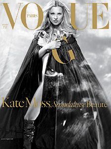 Kate in Chanel couture -This is my favourite cover. It makes her look like fashion royalty.
 Kate in Dior Homme jacket and Superfine jeans -This is my second favourite cover. It's the cover that reflects Kate's style and personality the most. And definitely the most suitable to the title 'Scandaleuse Beauté' ('Scandalous Beauty').
 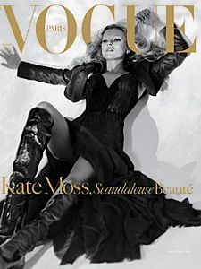 Kate in Giorgio Armani Privé, a Dior Homme bolero, Givenchy couture boots -OK, I admit I don't really like this cover. Kate and the photo is great of course but the cover just doesn't appeal to me.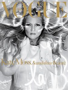


 |
| 


